Infrastructure Dashboard
The Infrastructure Dashboard provides a comprehensive overview of your Kubernetes cluster resources, offering multiple views to analyze utilization and capacity.
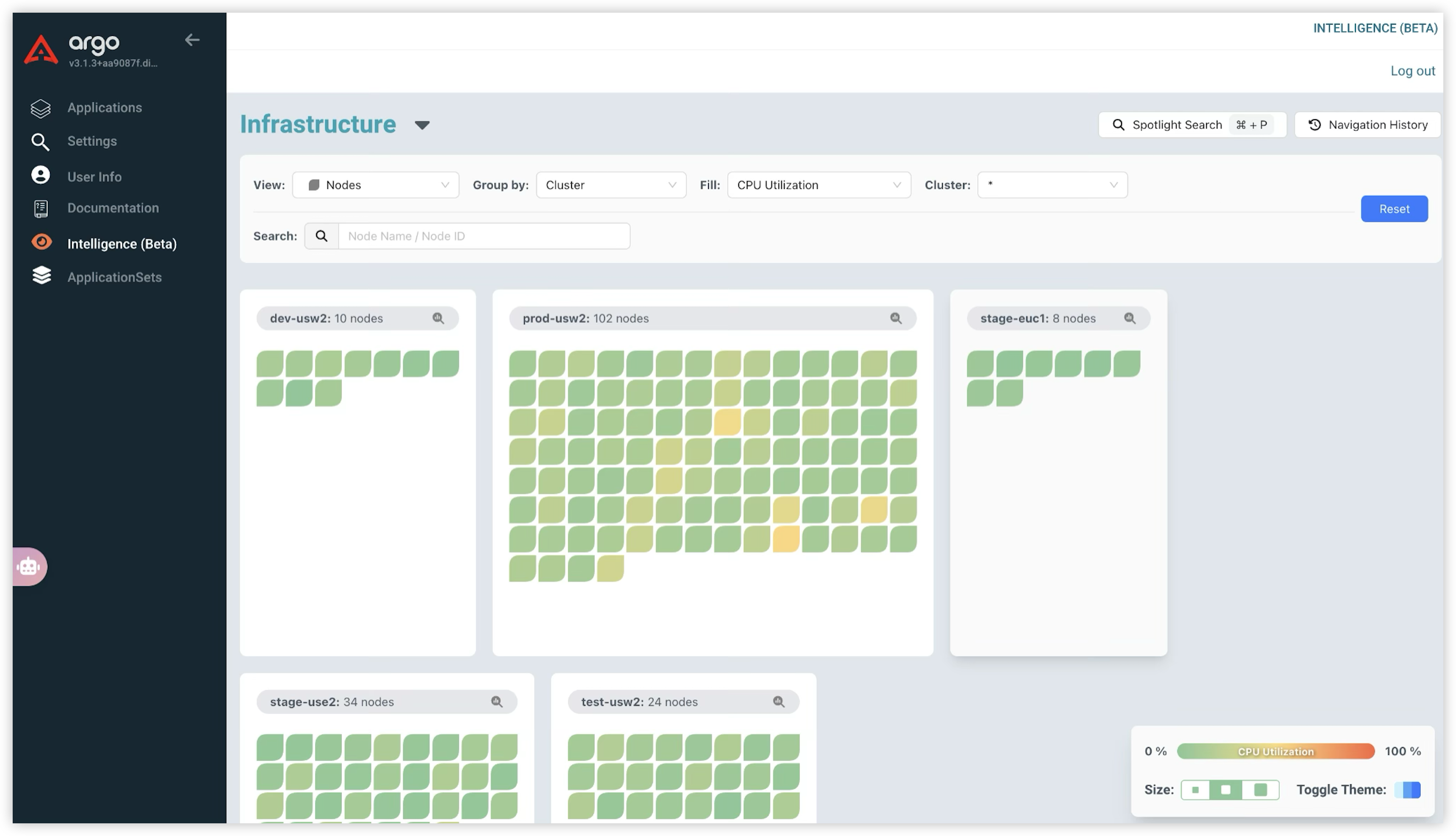
Node View
This view provides a high-level look at the nodes in your cluster, visualizing their resource utilization (e.g., CPU Utilization) to help you quickly assess node health. Each node is color-coded to represent its current consumption level:
- Green: Indicates low resource utilization.
- Yellow/Orange: Represents moderate resource utilization.
- Red: Signals high resource utilization, indicating the node is under heavy load and may require investigation.
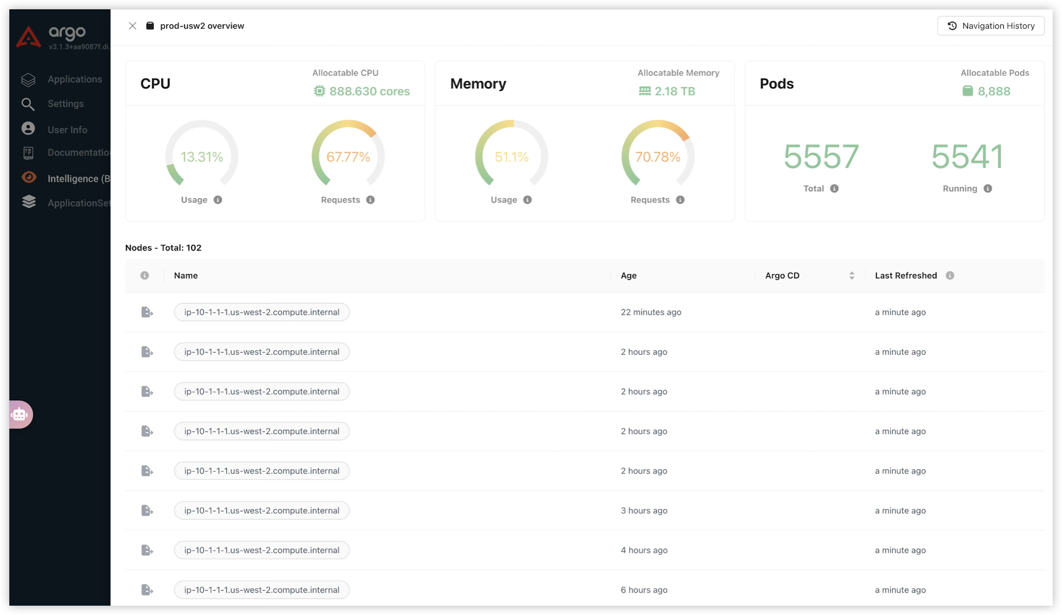
Clicking on a cluster provides a comprehensive overview of its status, displaying:
- CPU and Memory: Current usage and requests relative to allocatable capacity.
- Pods: Total and running pod counts.
- Nodes: A list of all nodes, including their current status and age.
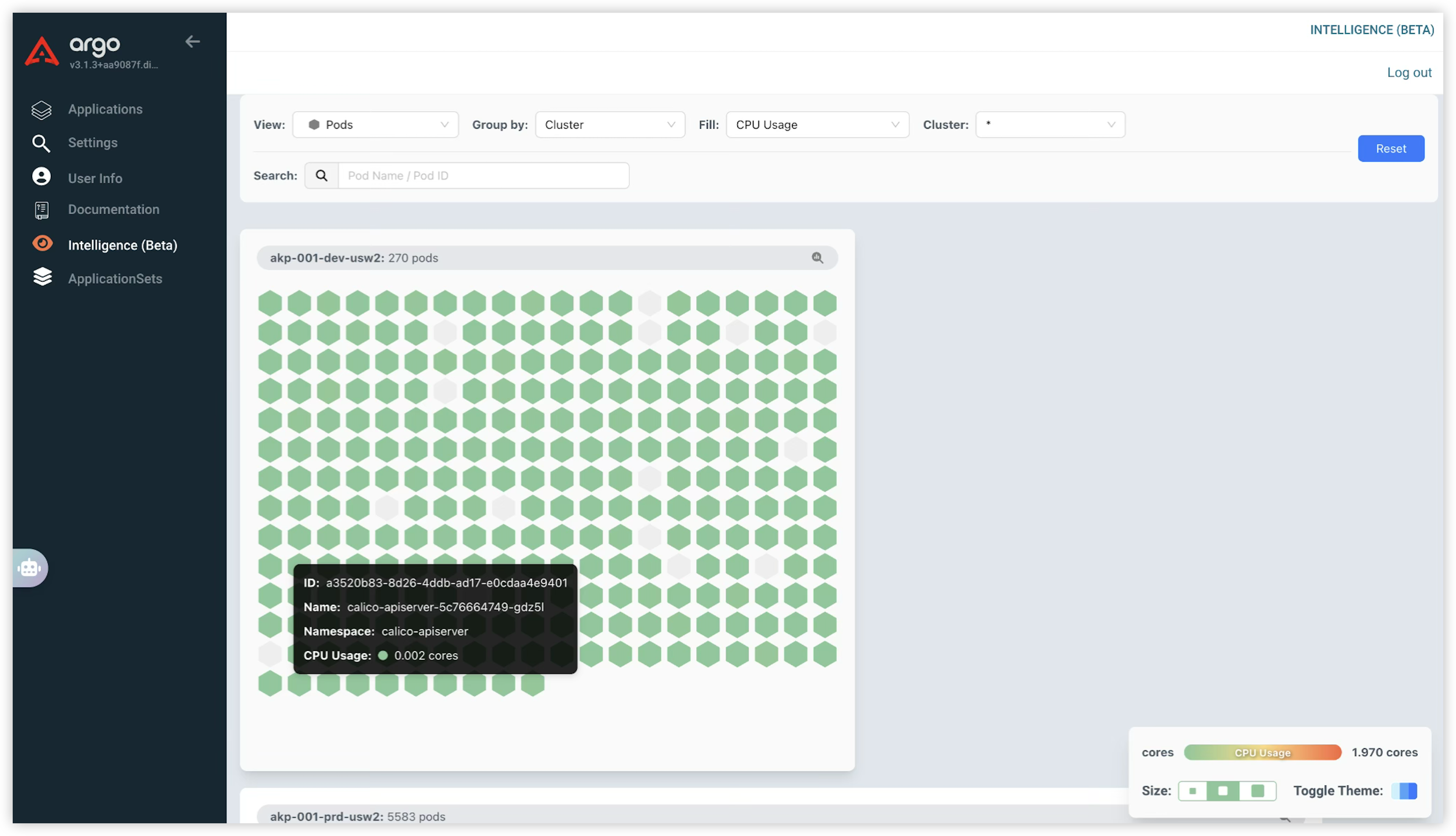
Pod View
The Pod view presents a visual grid of all pods, enabling you to:
- Visualize Pods: Pods appear as hexagonal tiles, with colors indicating resource usage.
- View Details: Hover over a pod to see its name, namespace, and CPU/memory consumption.
- Filter and Search: Utilize dropdowns to filter by metrics (e.g., CPU Usage) or search for specific pods.
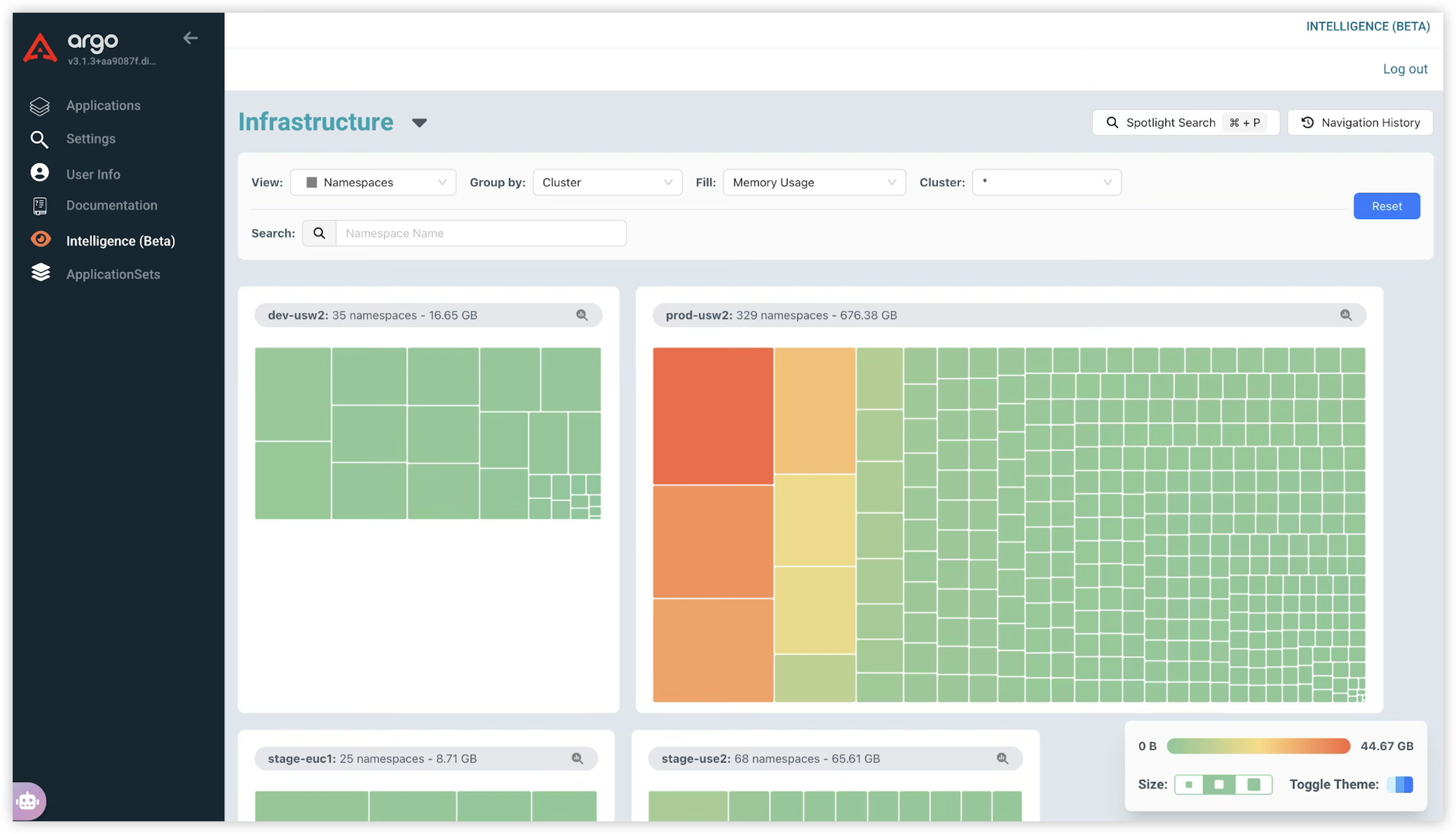
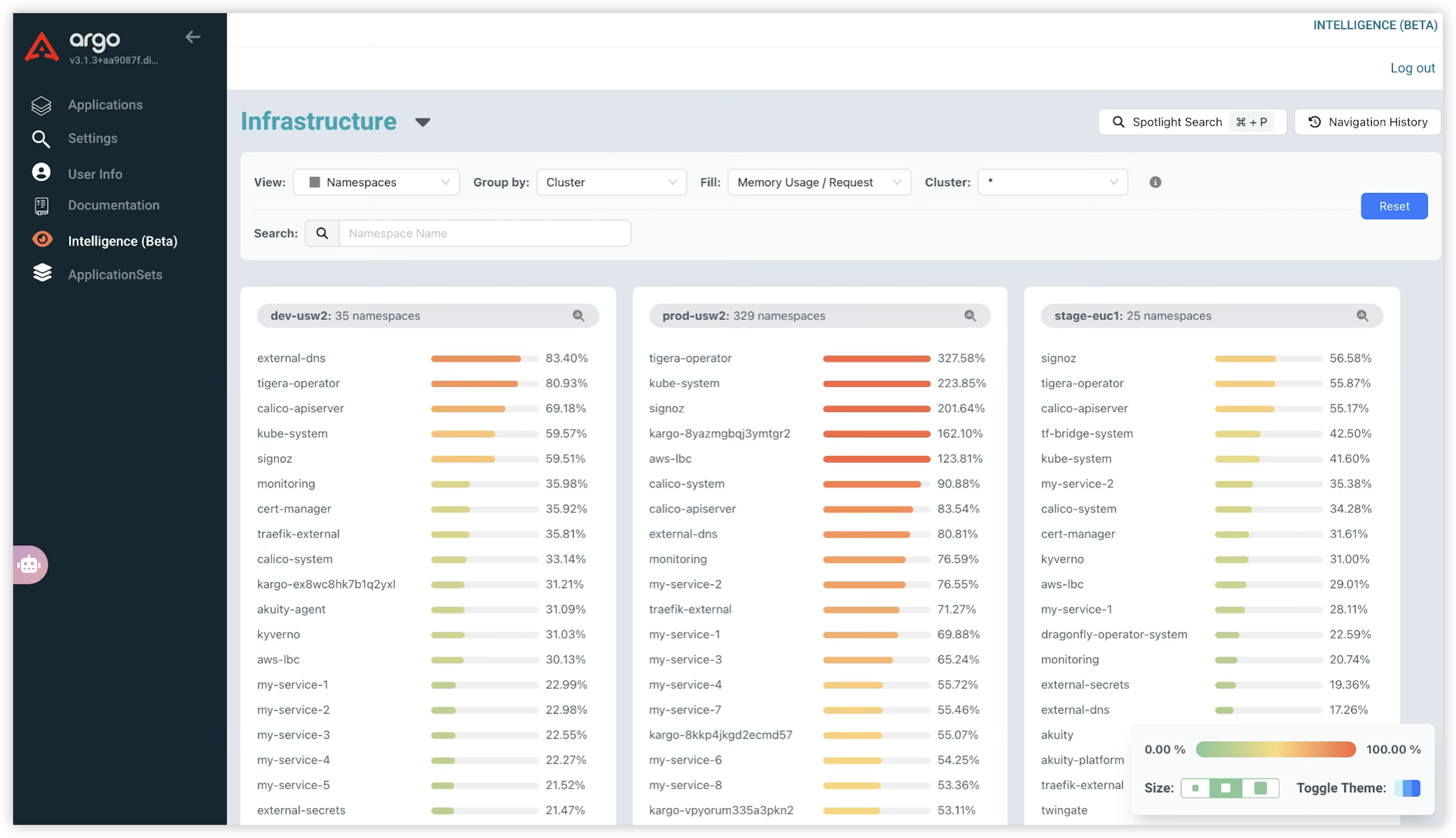
Namespace View
The Namespace view offers two ways to analyze resource consumption per namespace:
- Treemap: This visualizes namespaces as rectangles, with their size corresponding to their resource usage (e.g., Memory Usage).
- Bar Chart: This displays metrics such as Memory Usage/Request percentages for each namespace.
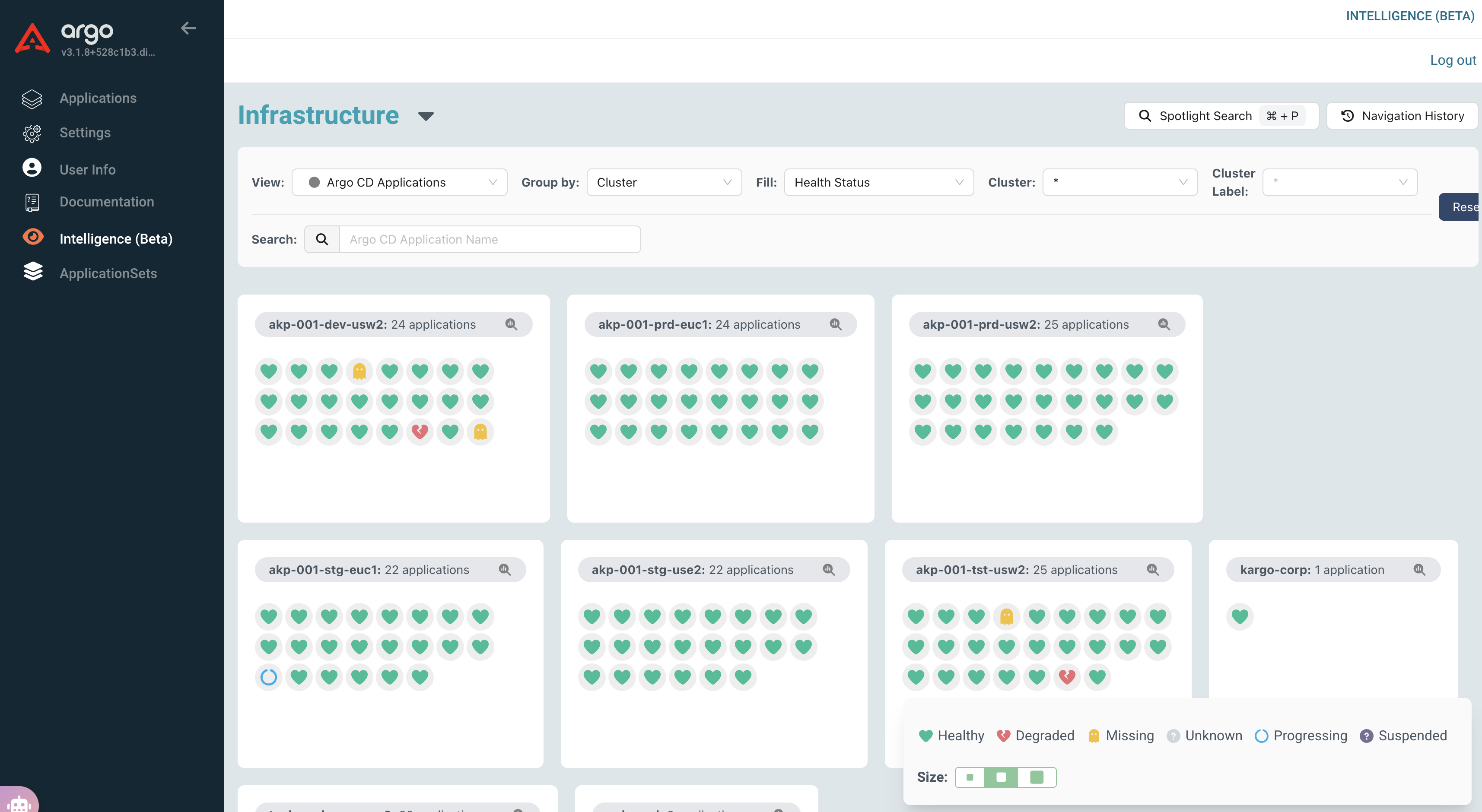
Argo CD Applications View
The Argo CD Applications view provides a comprehensive overview of all Argo CD applications in your cluster, enabling you to view the applications and their status.
- Visialize Health Status: Quickly view the health status of all applications and easily identify degraded or missing applications.
- Visualize Sync Status: Quickly view the sync status of all applications and easily identify applications that are out of sync.